Introduction
In order to test Differential Chromatic Refraction (DCR) correction algorithms we first need a metric that quantifies the severity of residual dipoles in difference images, in order to evaluate the performance of the correction.
To begin, I used the StarFast simulator (http://dmtn-012.lsst.io, https://github.com/lsst-dm/starfast_simulator) to generate multiple realizations of a couple small fields at u, g, and r bands and across a range of airmasses from 1.0 to 2.0.
These simulated images contain a realistic distribution of different stellar types using several thousand different model SEDs (interpolated Kurucz models, from sims_photUtils).
I then used ingestSimImages.py and processEimage.py from obs_lsstSim to generate standard calibrated exposures, and ran standard LSST image differencing using imageDifference.py with a calibrated exposure near zenith used as the template (using GetCalexpAsTemplateTask).
I ran two full simulations, each with a different random distribution of stars. For the first, “Faint”, simulation, I included ~2,500 stars ranging from type M to B with a density of sources roughly equivalent to a typical region of sky at a mid galactic latitude. In the “Bright” simulation I used the same total number of stars, but excluded type M stars which accounted for 75% of the number of stars in the “Faint” simulation. As a result, the second simulation contains four times as many bright sources and approximately four times the total flux. Each full set of simulations consisted of images of the “Bright” or “Faint” field in the three bluest LSST filters (u-, g-, and r-band), and at increments of 5 degrees in elevation angle from 30 to 85 degrees. Additionally, each image was made with the field either rising or falling, which mirrors the effect of DCR.
Figures 1 and 2 below show a small sub-region of the “Faint” and “Bright” difference images for each band at an airmass of 1.3, along with the corresponding g-band template image for reference. See Appendix: Additional Diagnostic Images for images of the full fields.
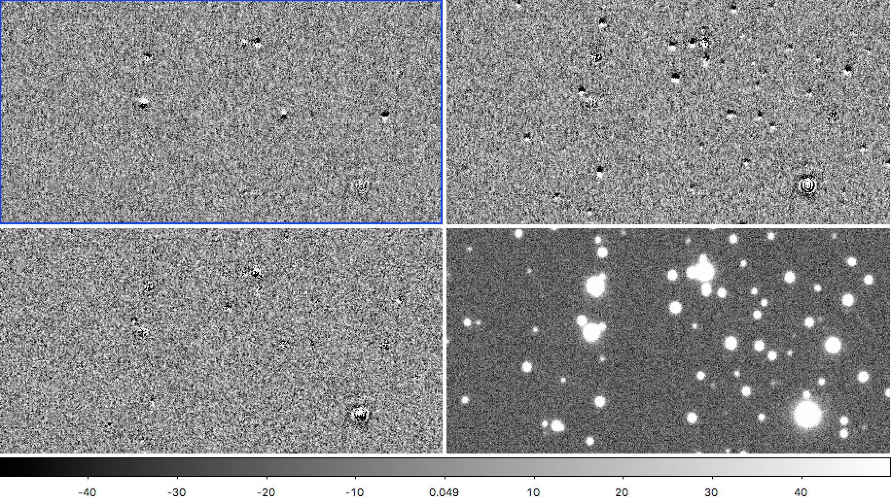
Figure 1 A small region from the “Faint” simulated images at airmass 1.3 differenced from a template at airmass 1.00. Left to right, top to bottom: u-band, g-band, r-band, and the g-band template image for reference.
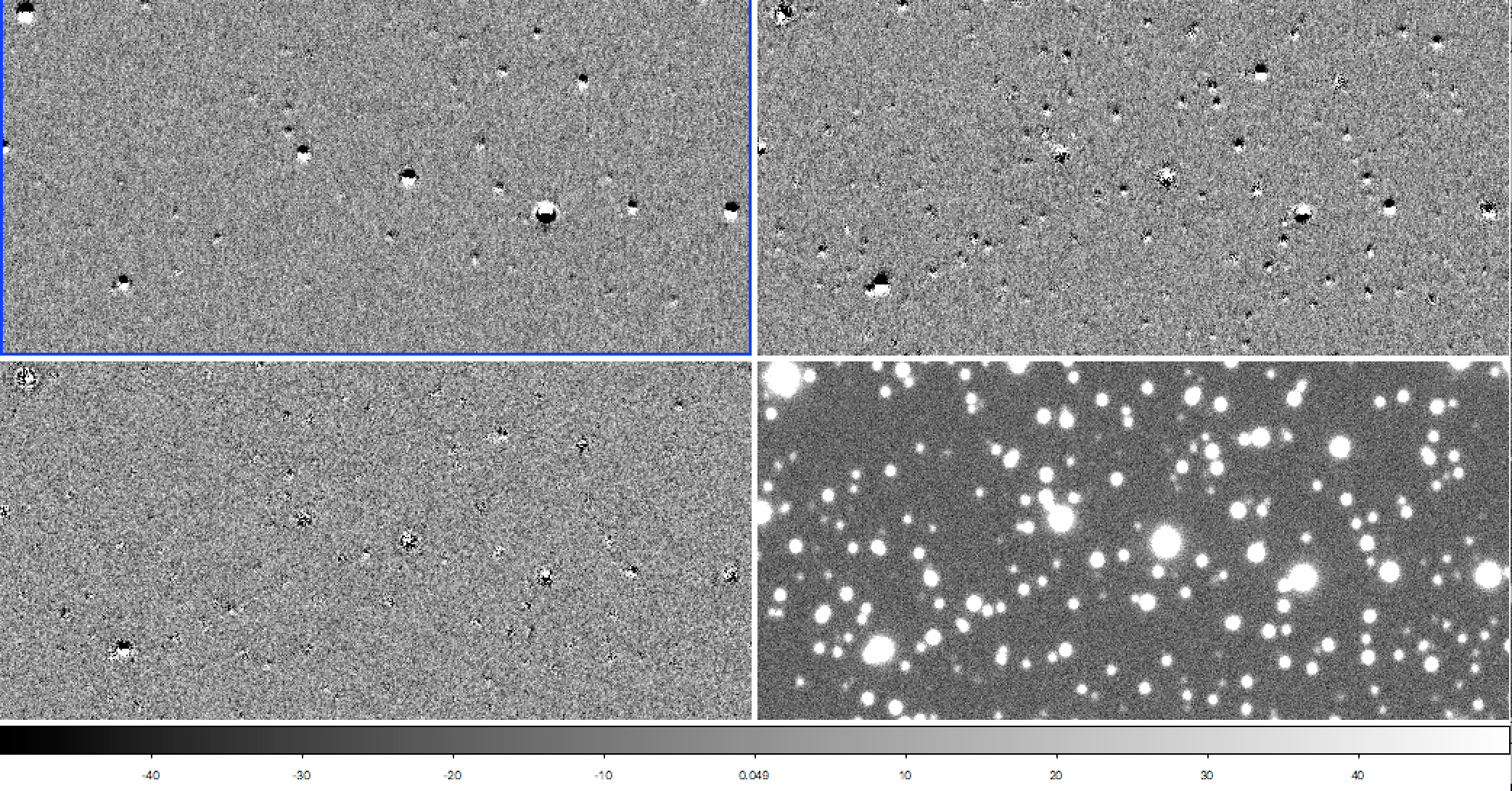
Figure 2 As Figure 1, but for the “Bright” simulated images which contain four times as many bright stars.
At first glance, it is apparent that dipoles are more prevalent in the g-band difference image of both simulations, which is due to three factors:
- The g-band filter is twice as wide in wavelength as u-band, balancing the larger change in index of refraction at u-band (see Figure 1 of https://github.com/isullivan/LSST-DCR/blob/master/DCR%20literature%20overview.pdf)
- Most stars of type A or cooler have a uniformly rising spectrum in u-band, which results in a similarly dispersed psf (see the dipole images of individual stars at the bottom of https://github.com/lsst-dm/starfast_simulator/blob/master/StarFast_example.ipynb). In g-band, by contrast, a typical type A star will have a falling spectrum, a type K star will have a rising spectrum, and in between stars will have a spectrum that is on average flat, but full of features. As a result, there is a greater variation in PSF shape due to DCR in g-band than in any other band.
- Related to the above two points, since the SEDs of many stars peak in g-band, and because the bandwidth is wider, most stars are brightest in g-band. With brighter stars, we should expect to see more dipoles above the noise floor.
Defining a Dipole Severity Metric
In order to leverage the full utility of LSST software, I wanted to use only the source lists generated by source detection and measurement in processEimage.py and the DIA sources generated with imageDifference.py. A metric of dipole severity could be defined a great many different ways from the parameters in the source tables, but after extensive trials and testing the following, though far from perfect, appears to be robust:
- First, define a reference flux to use as a normalization for the full catalog of sources extracted in standard source detection and measurement.
- Next, calculate the total significance of both positive and negative sources from dipole measurement on the difference image, and divide by the uncertainty in their flux.
- Finally, take the logarithm of 1 plus the difference image source significance divided by the square root of the reference flux. Dividing by the square root of the reference flux makes the quantity unitless, but the remainder of this step is fairly arbitrary and simply makes the output more easily human readable.
In code, the above looks like:
ref_src = butler_ref.get("src", dataId=_id)      # load the source list with a butler
flux_ref = ref_src[fluxrefKey]                   # Extract a flux measurement, e.g. "base_PsfFlux_flux"
flux_ref = flux_ref[~ref_src[flagrefKey]]        # Remove flagged sources
flux_ref = numpy.clip(flux_ref, 1.0, saturation) # Clip flux at saturation threshold (65000 counts)
flux_ref = np.sum(flux_ref)

dia_src = butler_dia.get("deepDiff_diaSrc", dataId=_id)                                  # load the difference image source list with a butler
combined_flux = (numpy.abs(dia_src[posFluxKey]) + numpy.abs(dia_src[negFluxKey]))        # Add the absolute value of positive and negative
significance = numpy.clip(combined_flux, 1.0, saturation) / numpy.abs(dia_src[sigmaKey]) # Clip at saturation threshold, and divide by the error in the flux measurement
significance = significance[~dia_src[flagKey]]                                           # Remove flagged sources
metric = numpy.log(1.0 + numpy.sum(metric) / numpy.sqrt(flux_ref))
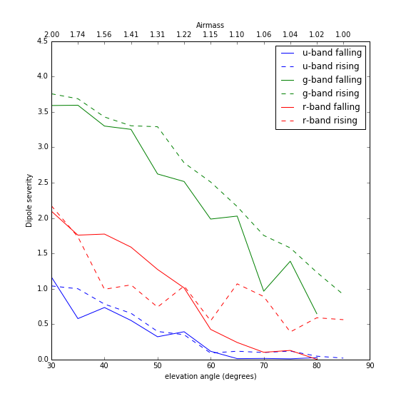
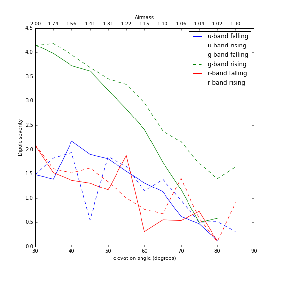
Finally, calculating the above dipole severity metric for the “Faint” and “Bright” simulations gives the following:
Dipole Severity Metric Plots
Conclusions
The dipole severity metric plotted above shows that g-band is considerably worse affected than either u- or r-band, which matches what we would expect from visual inspection of Figures 1 and 2. I don’t have a good explanation for why u- and r-band have such extreme scatter in the “Bright” simulation, except that it appears to be a real effect of the image differencing pipeline. In Figure 4 above, the “Bright” u-band field shows a pronounced dip at an elevation angle of 45 degrees only on the rising side of zenith. As seen in Figure 5 below, there really do appear to be far fewer dipoles when subtracting that particular observation, suggesting that the scatter in the plot of the metric above is capturing actual significant differences in the performance of image differencing. A final point worth noting is that the template used for each band was the simulation of the field at 85 degrees elevation angle on the falling side of zenith. At 85 degrees elevation angle, the airmass is only 1.0038 and should contain negligible DCR. However, there appear to be far fewer dipoles in the difference images for the other falling fields, that is, the observations taken on the same side of zenith.
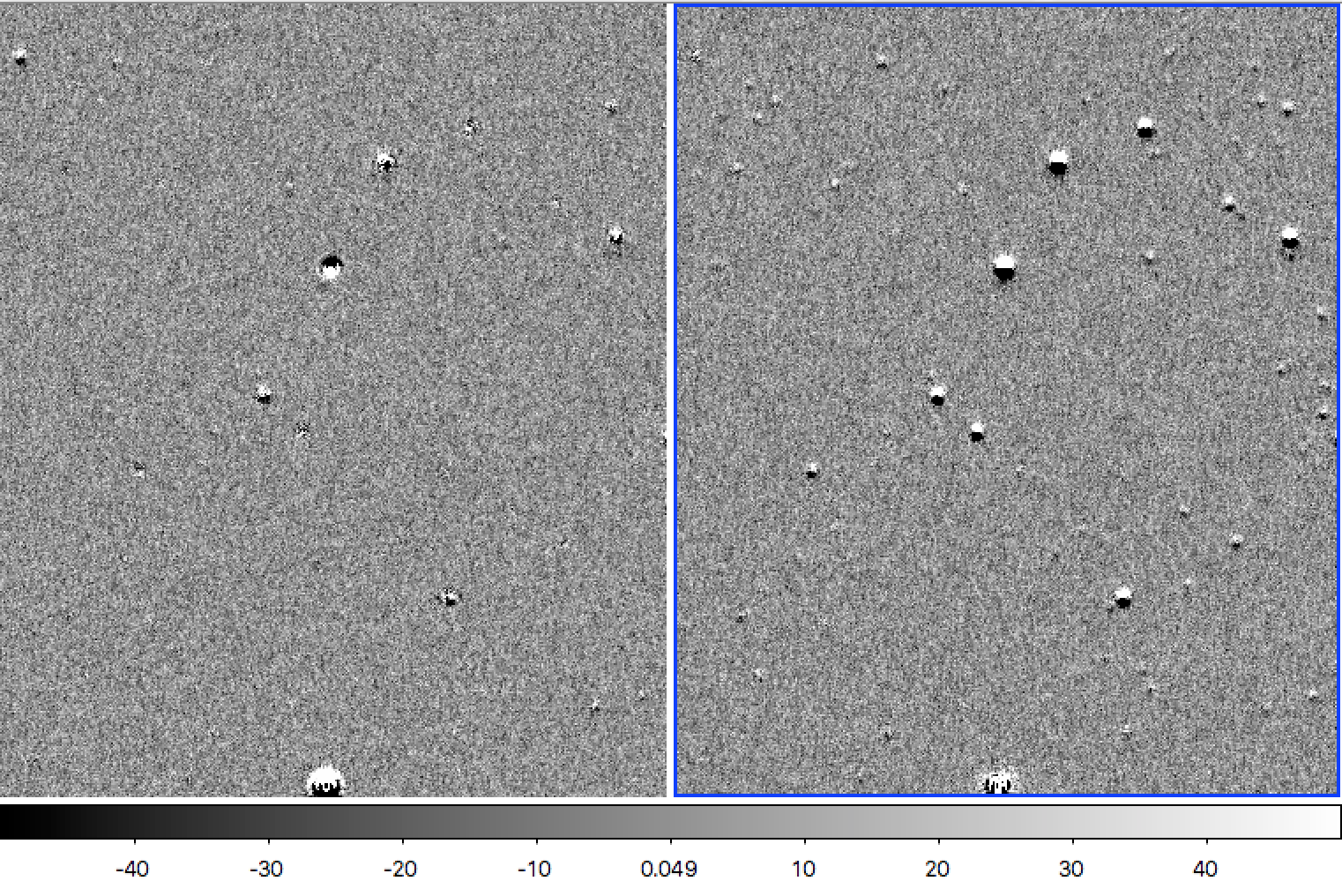
Figure 5 Comparison of “Bright” u-band difference images at elevation angle 45 degrees. The rising field is on the left, and falling on the right, and as captured by the dipole severity metric in Figure 4 there do indeed appear to be far fewer dipoles in the rising field. A visual comparison of the u-band rising image at elevation angle 45 to the rising image at 50 degrees (not shown) shows a similar subtraction quality difference.
Appendix: Additional Diagnostic Images
For the curious, FITS files of the calibrated template images, and airmass 1.3 science and difference images in the git repository for this tech note: https://github.com/lsst-dm/dmtn-019/tree/master/FITS%20data
Below are a few additional images of the full images used in the simulations for this note.
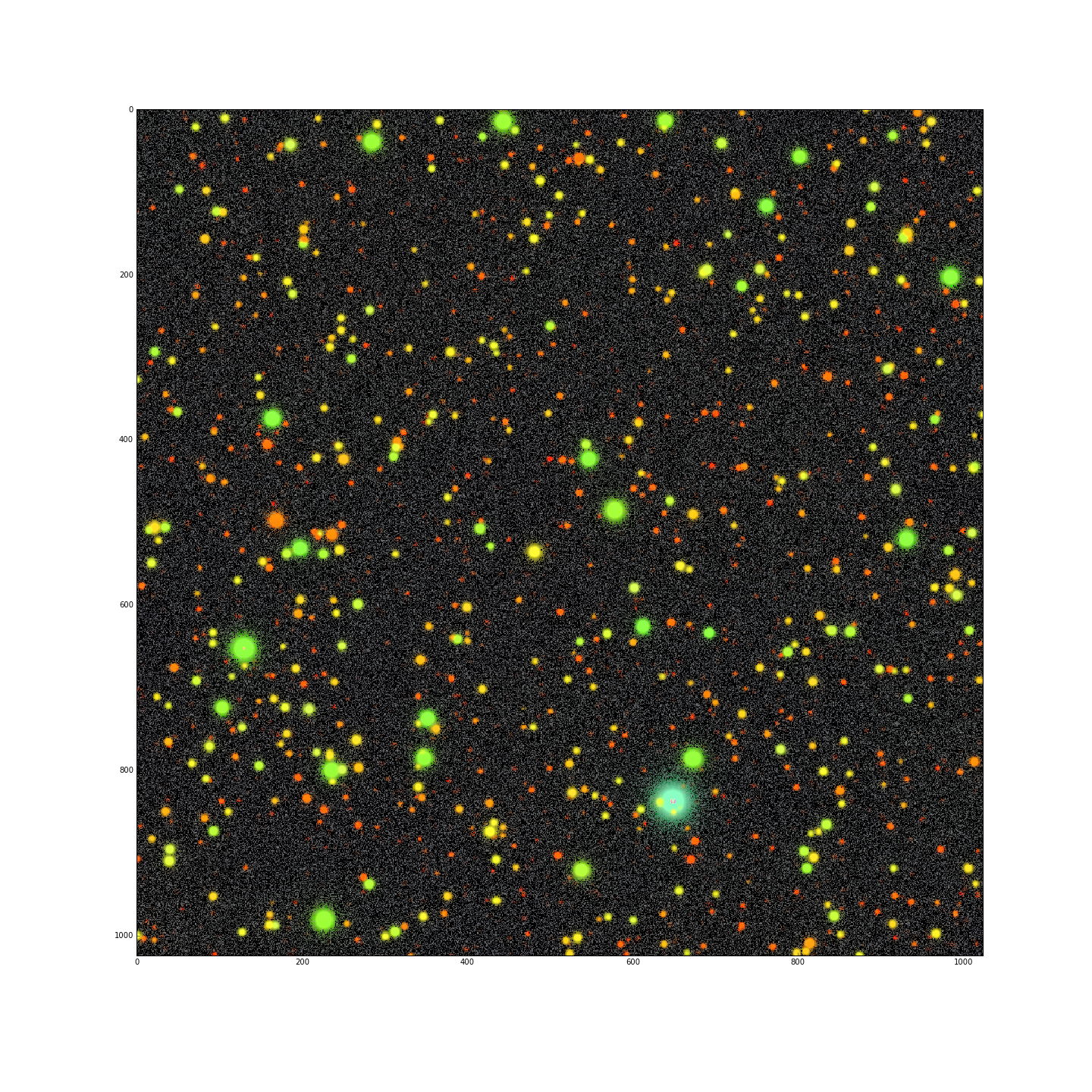
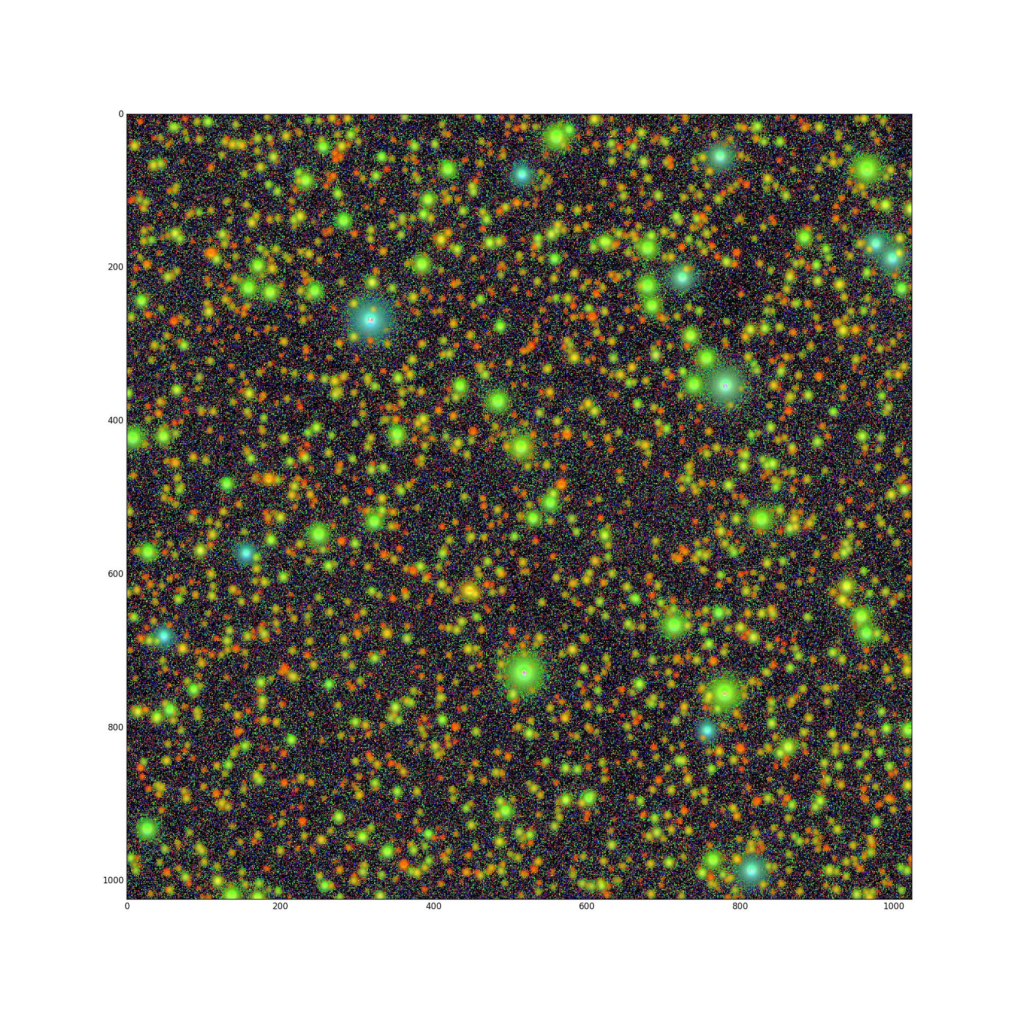
Figure 6 False color image of the “Faint” template images, with u-band = blue, g-band = green, and r-band = red. The simulated image contains roughly ~2500 stars ranging from many cool type M stars up to a single type B star.
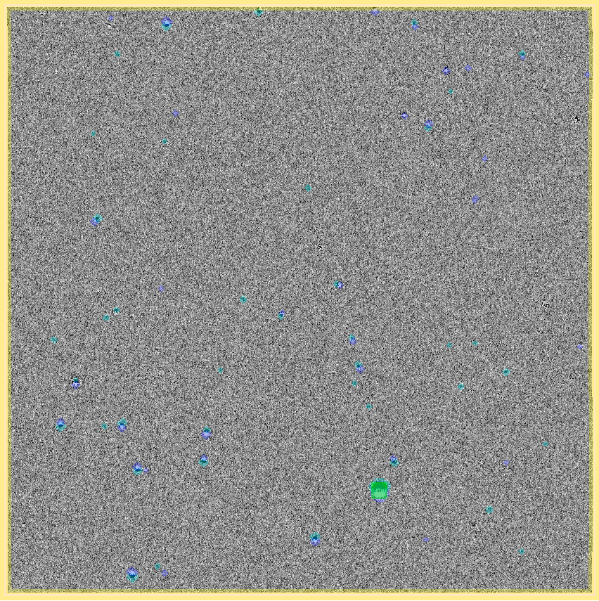
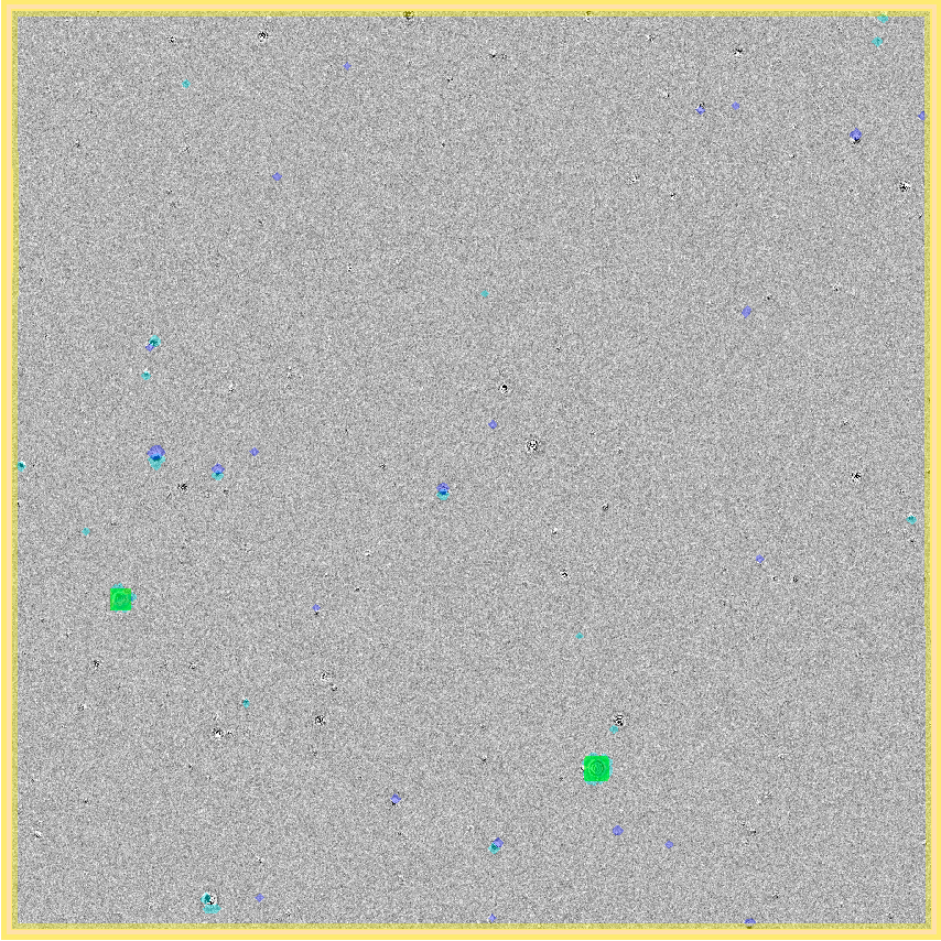
Figure 7 Full u-band “Faint” difference image at airmass 1.3 with positive and negative source detections masked in dark/light blue, saturated sources masked in green, and the edges masked in yellow.
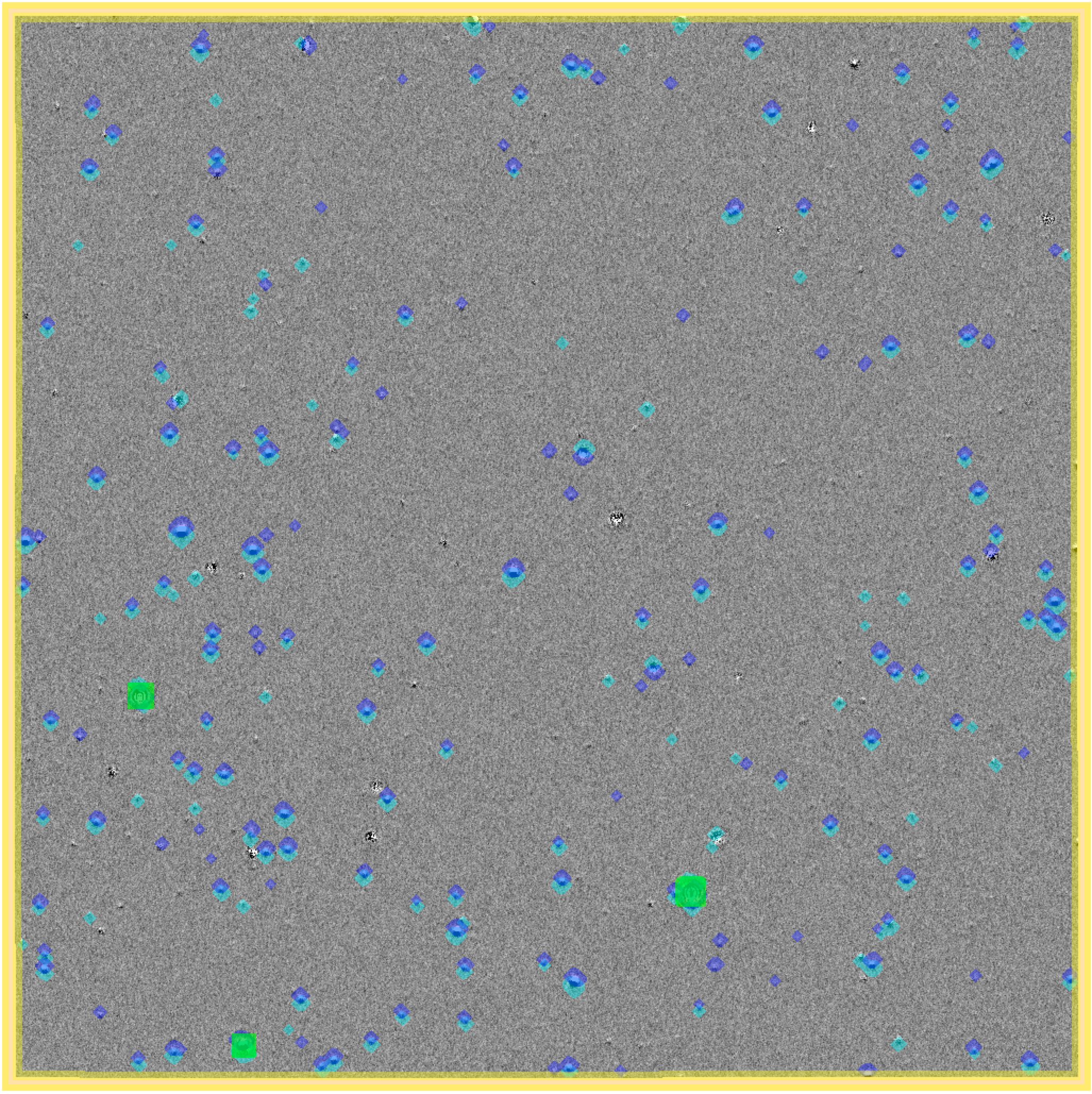
Figure 8 Full g-band “Faint” difference image at airmass 1.3 with positive and negative source detections masked in dark/light blue, saturated sources masked in green, and the edges masked in yellow.
